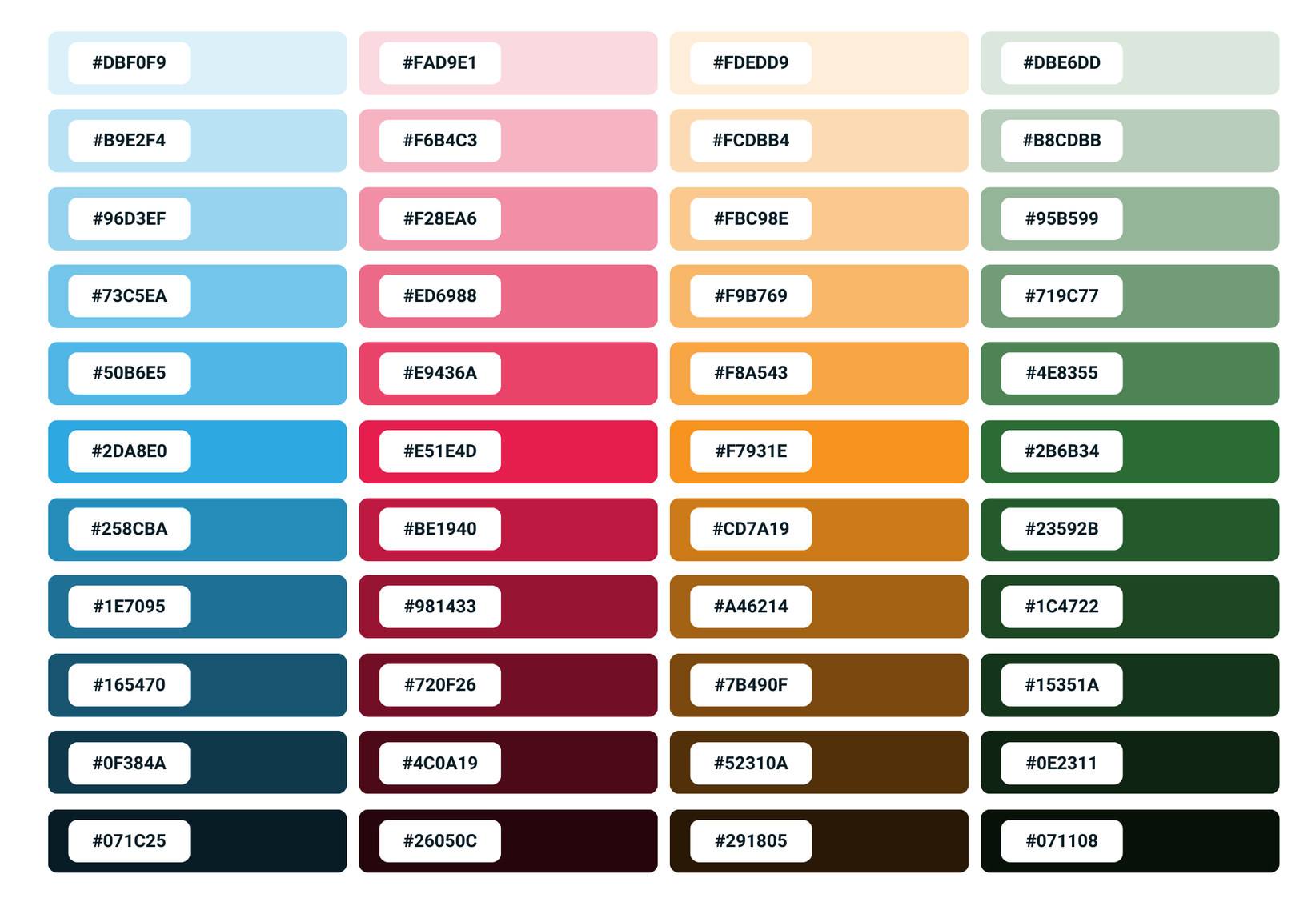
Brand Guidelines

QPunch is a smart project management tool that helps teams collaborate, plan, and execute projects efficiently. Our brand identity is built on the pillars of clarity, collaboration, and efficiency.

Brand Voice

Our brand voice is professional, friendly, and informative. We use clear and concise language that is easy to understand. We are also passionate about helping our users succeed, and this comes through in our communication.


Primary Color

These colors are a visual representation of our brand values. Blue represents clarity, green represents collaboration, orange represents efficiency, and red represents passion. These colors are also used in our logo, which is a stylized "Q" that is made up of four colored segments.

Tints & Shades

Typography

Primary/Secondary

Roboto

Roboto is a sans-serif typeface designed by Christian Robertson for Google. It is known for its clean, geometric lines and high legibility, making it a popular choice for digital interfaces and publications.

Bold

Semi Bold

Text Color

Aa

Aa Bb Cc Dd Ee Ff Gg Hh Ii Jj Kk Ll Mm Nn Oo Pp Qq Rr Ss Tt Uu Vv Ww Xx Yy Zz

01 02 03 04 05 06 07 08 09

Brand Logo

Our logo is a stylized "Q" that is made up of four colored segments. This logo is a visual representation of our brand values of clarity, collaboration, and efficiency.

QPunch Logo - M
QPunch Logo - S