Time-sheets

Time-sheets
QPunch’s live team tracking system provides real-time insights into your team’s workload, task progress, and resource allocation. The Overall Utilization Dashboard gives a clear view of team utilization across the subscription, helping you optimize resources and monitor performance instantly.
Real-Time Resource Insights.
Comprehensive Team Overview.
Dynamic Drill-Down Views.
Accurate Reporting & Decision Support:
Overall Utilization Dashboard
The Overall Utilization dashboard offers a comprehensive overview of how your team is being utilized across the entire subscription and can be accessed directly from the main QPunch dashboard. You’ll gain instant insights into your team’s workload, task progress, and resource allocation as activities unfold.
First upon opening the dashboard, users are presented with:
- Utilization Chart – Displays how much of the team’s total capacity is currently utilized. It provides a visual comparison between planned hours and available hours.
Below the chart, the following key metrics are shown:- Total Available Capacity: e.g., 22,544 hours
- Planned Hours: e.g., 370 hours
- Utilization Percentage: e.g., 2%
- Time Frame: Calculated until the end of the selected month
- Work Distribution Chart – Visually illustrates how resources are allocated across various departments or task types.
To view utilization for a specific time frame (e.g., March to May), you can select the middle month (April) to retrieve data for the previous, current, and following months.
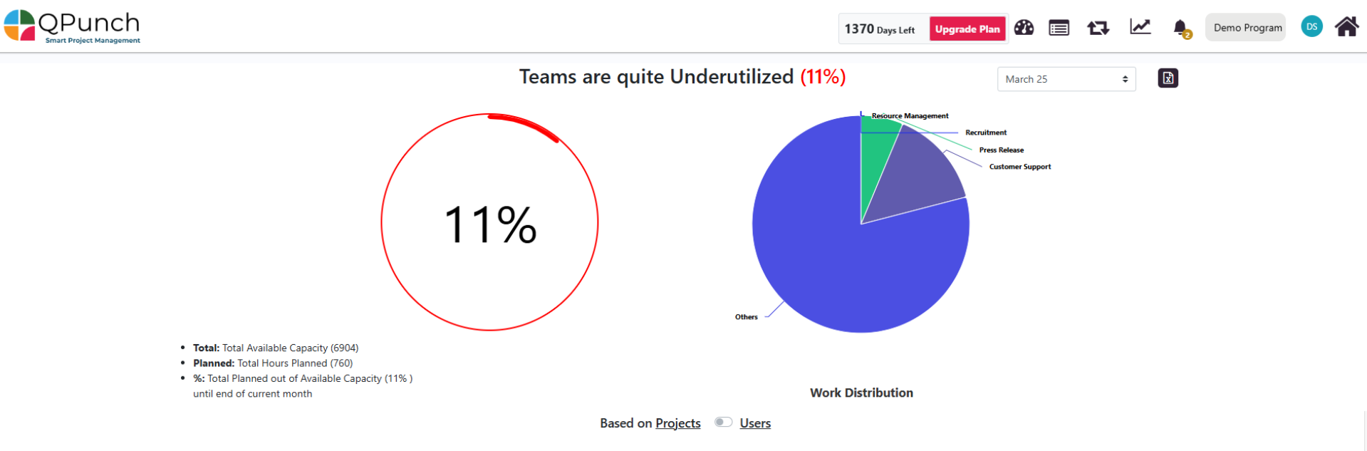
The dashboard also features a toggle that allows users to switch between two primary Utilization views:
- Project-Based View – Drill down by project → user → task
- User-Based View – Drill down by user → project → task
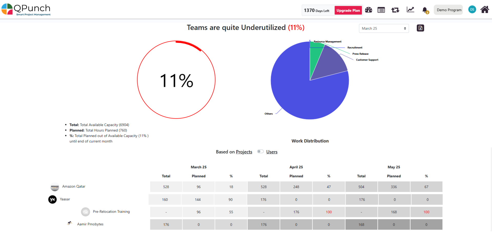
Project-Based Utilization Drill-Down
Now when toggle is switched to Project View, users can:
- View a list of projects in the subscription.
- Select a project to view the users assigned to it.
- Select a user to view all associated tasks within that project.
For each selected month, the table provides:
- Total hours available (Actual) vs Planned Hours
- Project, users and task-level Utilization Percentages
For the project its users and for the tasks in it.
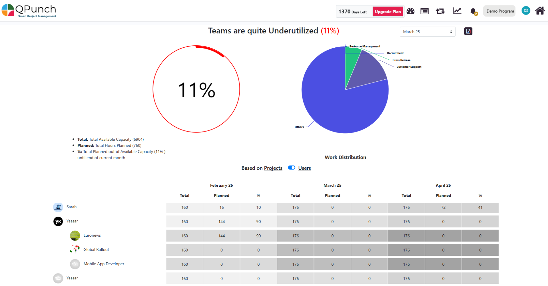
User-Based Utilization Drill-Down
And now when toggle is switched to User View, users can:
- Access a list of all team members.
- Select a user to view all projects they are involved in.
- Select a project to view tasks that the user is assigned to within that project.
For each selected month, the table provides:
- Total hours available (Actual) vs Planned Hours
- User, Project and task-Level Utilization Percentages
For the Users then the projects they are involved in and their tasks.
Conclusion:
QPunch’s Timesheet and Utilization Dashboard is more than just a tool—it’s a decision-making powerhouse that helps teams plan, act, and deliver smarter. With real-time tracking through dynamic charts and detailed tables, teams can quickly monitor utilization and performance. Flexible date filters and export options make it easy to create customized reports and share them efficiently. Color-coded indicators allow managers and team leads to spot resource imbalances quickly. Designed for everyone—project managers, team leads, and executives—QPunch helps with task alignment, workload distribution, and strategic decisions. Its intuitive, responsive interface ensures a smooth experience on any device, making it easier to manage resources wherever you are.
Address On Maps
Ready To Get Started with Smart Project Management?