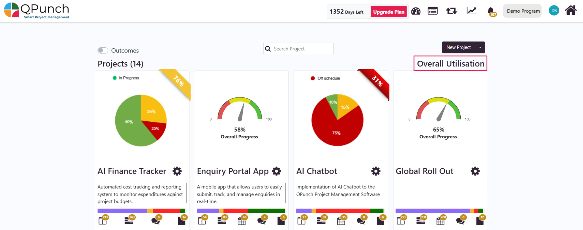
Overall Utilization
The Overall Utilization Report in QPunch offers a comprehensive view of how resources are allocated and utilized across your entire subscription. This dashboard helps project managers, team leads, and stakeholders assess team performance, optimize resource planning, and track real-time workload distribution. This guide will walk you through how to access, navigate, and use the dashboard to its fullest potential.
Accessing the Overall Utilization Dashboard
- From the QPunch Home Page, click on the Overall Utilization icon located on the main dashboard.
The system will load a dashboard showing organization-wide utilization insights.
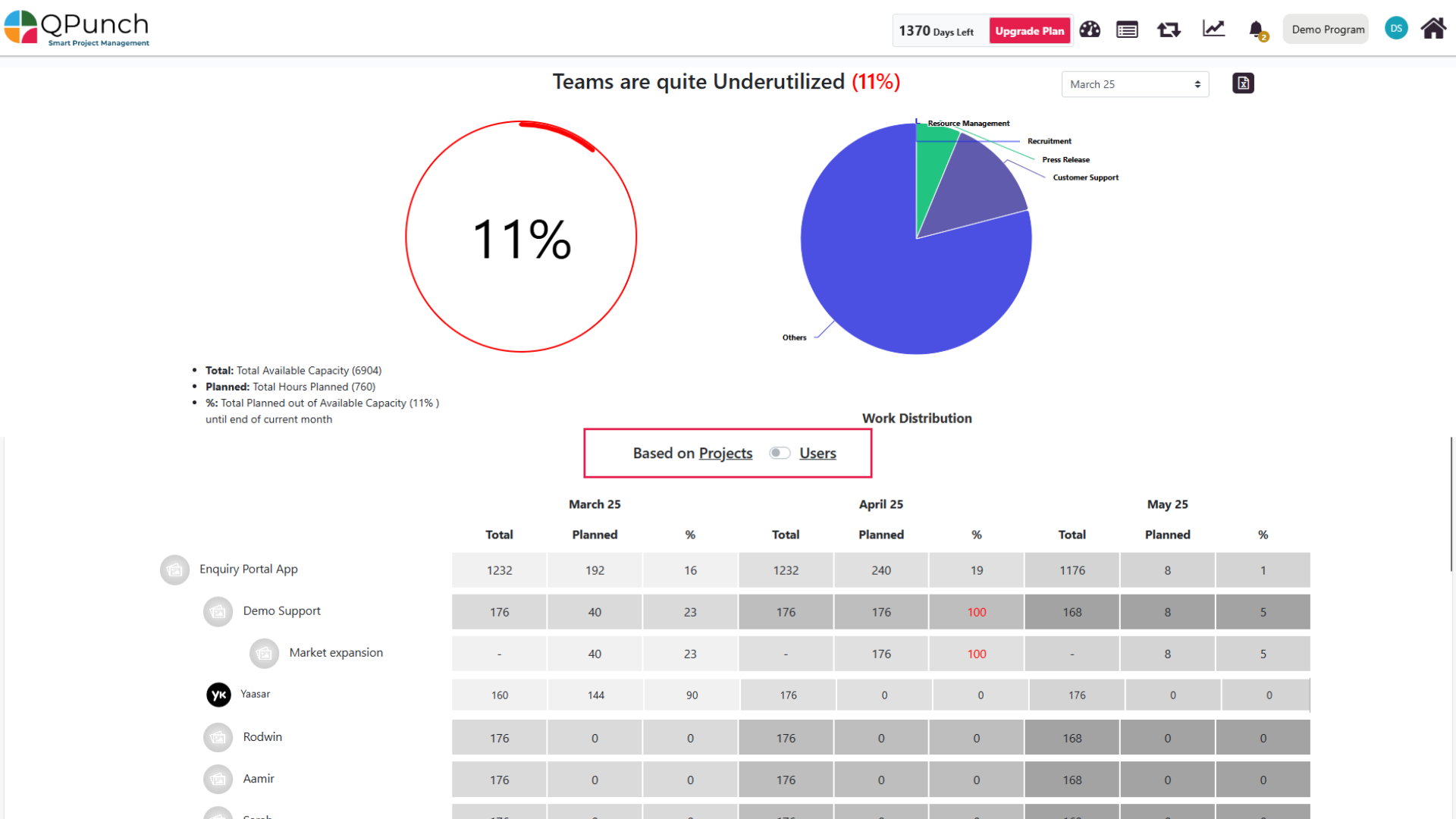
You can select a specific month range by choosing the middle month (e.g., select April to view data for March, April, and May) and also you can download the report using the icon on the right side of the duration field.
Understanding the Default View
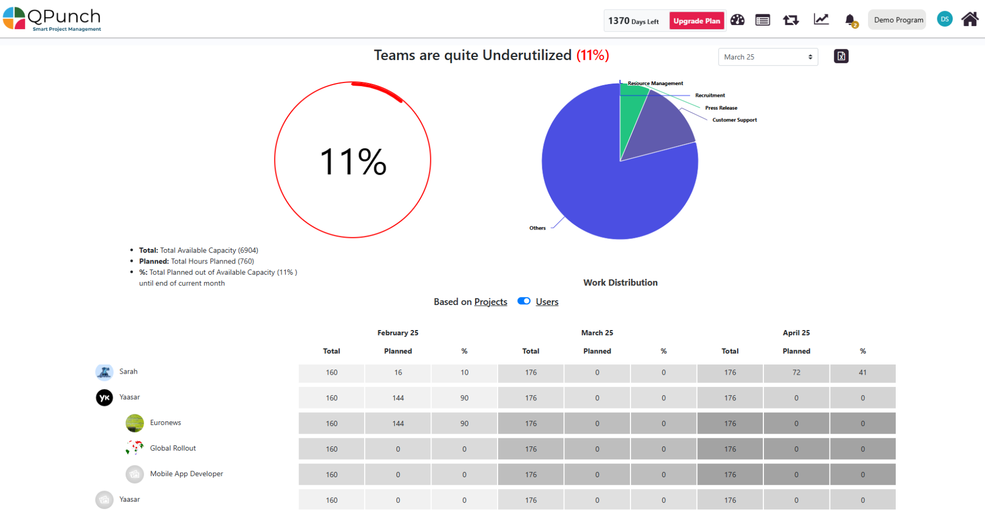
Once the dashboard loads, you will see:
- Utilization Percentage Chart: A pie chart displaying how much of your team’s total available hours are currently utilized.
- Example:
- Total Capacity: 22,544 hours
- Planned Hours: 370 hours
- Utilization: 2%
- This percentage is calculated until the end of the selected month.
- Example:
- Work Distribution Chart: On the right of the pie chart, this chart breaks down resource allocation by departments, task types, or categories across all projects.
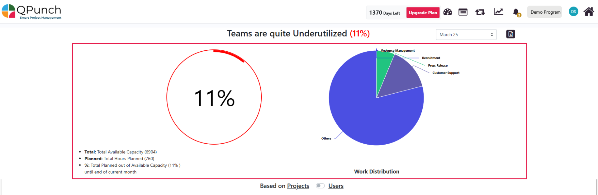
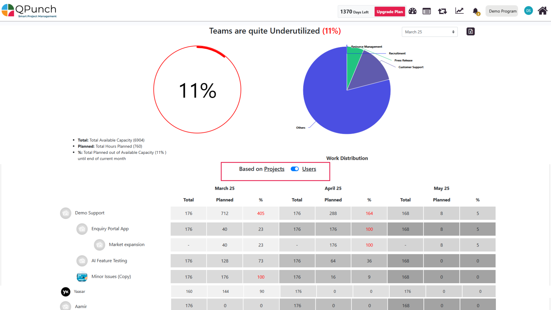
- View Toggle: Located below the charts, this switch allows you to toggle between:
- Project-Based View
- User-Based View
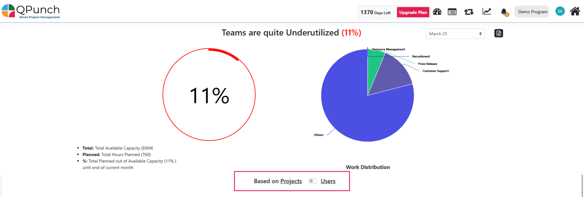
Project-Based Utilization Drill-Down
Now when toggle is switched to Project View, users can:
- view a list of all projects currently in the subscription.
- Click on a project to see the users assigned to it.
- Click on a user to view the tasks they’re assigned to within that project.
For each selected month, the table provides:
- Total hours available (Actual) vs Planned Hours
- Project, users and task-level Utilization Percentages
For the project its users and for the tasks in it.
User-Based Utilization Drill-Down
And now when toggle is switched to User View, users can:
- view a list of all users in the subscription.
- Click on a user to see the projects they’re involved in.
- Select a project to view the tasks that user is working on within it.
For each selected month, the table provides:
- Total hours available (Actual) vs Planned Hours
- User, Project and task-Level Utilization Percentages
For the Users then the projects they are involved in and their tasks.
key features:
- Toggle Views: Switch between project-based and user-based utilization views.
- Drill-Down Insight: Dive from project/user level down to individual tasks.
- Utilization Chart: See team utilization with actual vs planned hours in a pie chart.
- Work Distribution: Visualize how work is spread across departments and task types.
- Month Selector: Choose the middle month to view data across three months.
- Color Indicators: Instantly identify under or over-utilized resources.
- Export Reports: Download reports in PDF or Excel format.
- Task Data Source: Utilization is calculated using Kanban, Gantt, and Calendar tasks.
Conclusion:
The Overall Utilization Report in QPunch is a powerful dashboard that provides real-time visibility into how your team’s time and capacity are being used across projects. With its project- and user-based drill-down views, interactive charts, and clear visual indicators, it becomes easier to identify resource bottlenecks, balance workloads, and improve overall planning accuracy. Whether you’re managing teams or overseeing strategic outcomes, this report ensures you make informed, data-driven decisions.
Address On Maps
Ready To Get Started with Smart Project Management?